
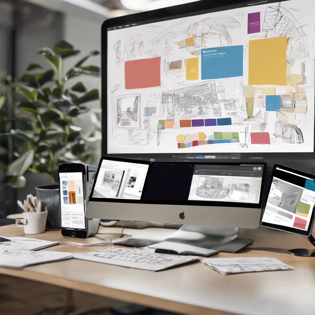
I specialize in web design and development, creating custom WordPress solutions that empower businesses to take control of their digital presence. With experience spanning content strategy, SEO optimization, and front-end development, I focus on building websites that are both visually engaging and highly functional. I’ve worked across a range of industries, managing large-scale multisite networks, developing custom plugins, and integrating AI-driven efficiencies. Passionate about training and knowledge sharing, I help businesses and teams confidently navigate the evolving digital landscape.
I have a strong background in website strategy, development, and optimization, helping businesses maximize their digital presence. With expertise in WordPress customization, front-end development, and API integrations, I build tailored solutions that enhance functionality and user experience. My approach prioritizes SEO, performance optimization, and responsive design to create fast, accessible websites. I also have extensive experience in project management, version control, and stakeholder collaboration, ensuring seamless development workflows. Beyond development, I provide training and documentation, empowering teams to manage and grow their websites with confidence.
AI is becoming a game-changer in web development, and I’m passionate about leveraging its potential to create smarter, more efficient websites. From automating content optimization to enhancing user experiences through personalization, AI is revolutionizing the way we build and manage digital platforms.
In my work, I integrate AI-driven tools to improve SEO strategies, analyze user behavior, and streamline development workflows. Whether it’s using AI-assisted code generation to speed up project timelines or implementing intelligent automation for content management, I focus on making websites more adaptive and future-proof.
As web development continues to evolve, I stay ahead by exploring innovative AI solutions that enhance accessibility, performance, and engagement. My goal is to build websites that not only meet today’s digital demands but also anticipate the challenges of tomorrow.


User experience (UX) has always been at the heart of my approach to web development. I believe that a well-designed website should not only look great but also feel intuitive, accessible, and frictionless for users. My focus is on crafting seamless digital experiences that prioritize usability while balancing aesthetics and performance.
To achieve this, I stay up to date with the latest advancements in JavaScript, leveraging modern frameworks and libraries to build dynamic, interactive, and highly responsive web applications. Whether it’s optimizing front-end performance with React, enhancing animations with GSAP, or integrating AI-driven features, I use JavaScript to push the boundaries of what’s possible in UX design.
By combining thoughtful UX strategies with cutting-edge development techniques, I ensure that the websites I build are not just functional but truly engaging—helping businesses connect with their audiences in meaningful ways.
Keeping up with the latest advancements in CSS is essential for creating flexible, high-performance websites. As web development evolves, responsive design has become more intuitive and efficient, thanks to improvements in Flexbox, CSS Grid, and container queries.
Flexbox remains a cornerstone for building dynamic layouts, offering powerful alignment and distribution capabilities. Recent updates, such as the gap property for Flexbox, allow for easier spacing between elements without extra margins. Combined with CSS Grid, which provides two-dimensional layout control, developers can create complex, responsive designs with minimal code.
Mobile-first design remains the standard, ensuring websites load quickly and adapt seamlessly to different screen sizes. Modern CSS techniques, such as min(), max(), and clamp(), allow for fluid typography and spacing, enhancing usability across devices. Additionally, introducing container queries is a game-changer, enabling components to adjust based on their parent container rather than just the viewport.
By leveraging these advancements, I create websites that are not only visually engaging but also optimized for performance, accessibility, and future scalability. Responsive design isn’t just about shrinking a desktop site to fit a mobile screen—crafting experiences that feel natural and intuitive on any device.
Love them or hate them, Wyswig builders like Elementor and DIVI speed up the building process and allow clients to edit their own websites after the web developer has moved on to the next project.
For speed, I often use tools like Elementor to allow my clients to build websites quickly. However, I could not do so effectively if I did not understand the code behind their use of Flexbox and GRID layouts in depth.
I build layouts in HTML and CSS and convert them into Themes and editable widgets to get the flexibility of design needed for each client.