 Deciding what content goes onto your website front page is never a simple formula. If you work in a large organization, then almost every department will want a piece of what they see as prime real estate. Too much content and you loose impact, too little and you miss an opportunity to highlight the best of what you offer.
Here are my top ten tips and tricks.
1. Make your front page your shop window
Your front page should showcase what you will offer your customers. Like a good shop window, you want to draw people in with the best of what you have to offer. Share the passion for what you do and who you are. If you have a new products or services, that you are really proud of, this is the time to showcase them. Entice and excite your visitor, don’t send them to sleep.
2. Show examples of good content
If you have good content include an abstract. Don’t describe it. Show it. This can include teasers or images that will encourage people to go further.
3. Use images to make people pause
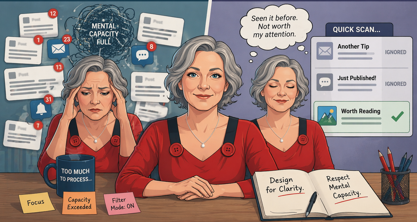
We communicate best visually. Use images to capture the attention and sign post important information. People don’t read they scan. Images will attract their attention and encourage them to stop and actually read the text.
4. Identify the main tasks of your customers visit
Your customers often come to your site with a small group of main tasks.
- Whether buying that brand new product
- Finding information on the latest discounts and offers
- Or contacting customer support about a problem or complaint.
If visitors can’t start these key activities they won’t go any further. Make it easy and your customer will not become frustrated or go straight to your competition.
5. Your website is for your customers not your staff
An important factor to remember is that you, or your staff, are not your key market. Everyone internally will want a link. Ensure that you are meeting the needs of your external market. You are not your customers. Keep internal communications for your intranet where they belong.
6. Make content relevant and up to the minute
Search engines will give prominence to sites that have frequently updated content. Ensure that you at least update your front page on a monthly basis. It is preferable to have new content weekly or even daily. It is important to keep your content fresh. If you don’t have the resources to update it on a regular basis try rotating pre-prepared features.
7. Take advantage of topical events and seasonal interests
Making content seasonal or taking advantage of national or global events will make your website feel fresher. While it may seem like jumping on the band wagon to link up with events like the royal wedding, if you have products that can be linked, then you are missing an opportunity.
8. Include a search box
Many visitors go straight to the search function to find information. Keep the search box in an easy to find place. Most sites keep it at the top right in the header or sidebar.
9. Interact with your visitors
Get feedback from visitors to find out what they want. Giving people activities, that are easy and quick to complete, will allow you to gain invaluable user feedback. Try short polls, surveys or competitions to encourage interaction.
10. Site navigation should be easy and obvious
Too many visitors do not make it be beyond the front page make sure your front page is an entrance to your site and not a dead end.


