You already know what a red button means before you read the label.
Most users decide what feels safe, urgent, clickable, dangerous, or trustworthy before they consciously process the interface itself. Colour works faster than language. It shapes behaviour before thought catches up.
In digital products, colour is not decoration. It is communication.
Used well, colour creates hierarchy, guides movement, reinforces trust, reduces friction, and gives interfaces emotional clarity. Used poorly, it creates confusion, hesitation, noise, and cognitive overload.
Good colour systems do not simply make products beautiful. They make decisions easier.
Colour in UX is not decoration. It is behavioural guidance.
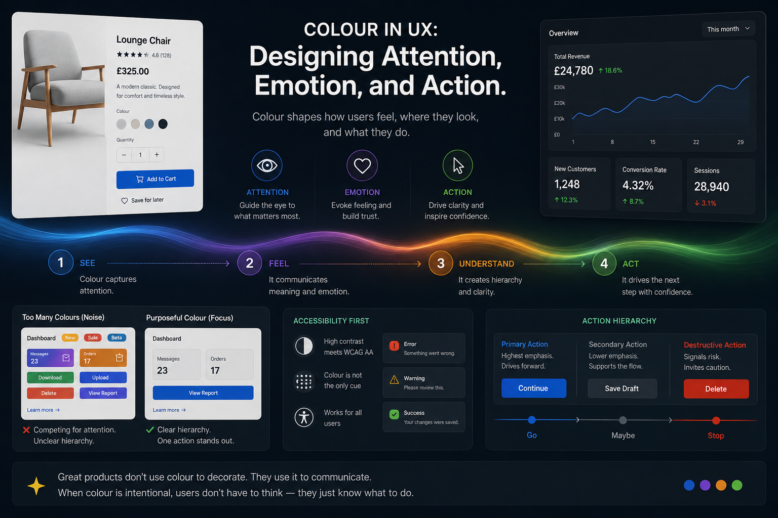
Quick Principles
Good interface colour creates hierarchy, guides attention, reduces noise, and helps users act with confidence.
One Dominant Accent
Use colour intentionally so primary actions stand out immediately.
Saturation Controls Emphasis
Vivid colours attract attention. Muted colours support hierarchy.
Red Creates Hesitation
Destructive actions should feel deliberate, not frictionless.
Neutral Tones Reduce Noise
Restraint gives important actions space to breathe.
Colour Guides Action
Users should instinctively know where to look next.
Accessibility Comes First
Colour should reinforce meaning — never carry it alone.
Colour Communicates
Before discussing palettes or aesthetics, it helps to understand what colour is actually doing inside an interface.
Colour communicates:
- Hierarchy
- Emotion
- Attention
- Trust
- Risk
- Direction
- Status
- Momentum
It also shapes small but important interface moments: whether a disabled button feels unavailable, whether a notification badge feels urgent, whether a success message feels reassuring, or whether a form error makes the user pause without feeling punished.
Every colour decision changes how an interface feels to use.
A vivid accent colour immediately attracts attention. A muted tone recedes into the background. Dark tones feel heavier and more serious. Lighter tones feel open and approachable.
The emotional rhythm of a product is often controlled less by typography or layout than by the way colour is distributed across the experience.
Colour Is Not Decoration. It Is Navigation.
One of the most important jobs colour performs in interface design is wayfinding.
Users should never have to stop and consciously ask:
“What am I supposed to do next?”
Good colour systems quietly answer that question.
The same way a hiking trail uses markers to guide movement through a landscape, interfaces use colour to guide users through actions, decisions, and flows.
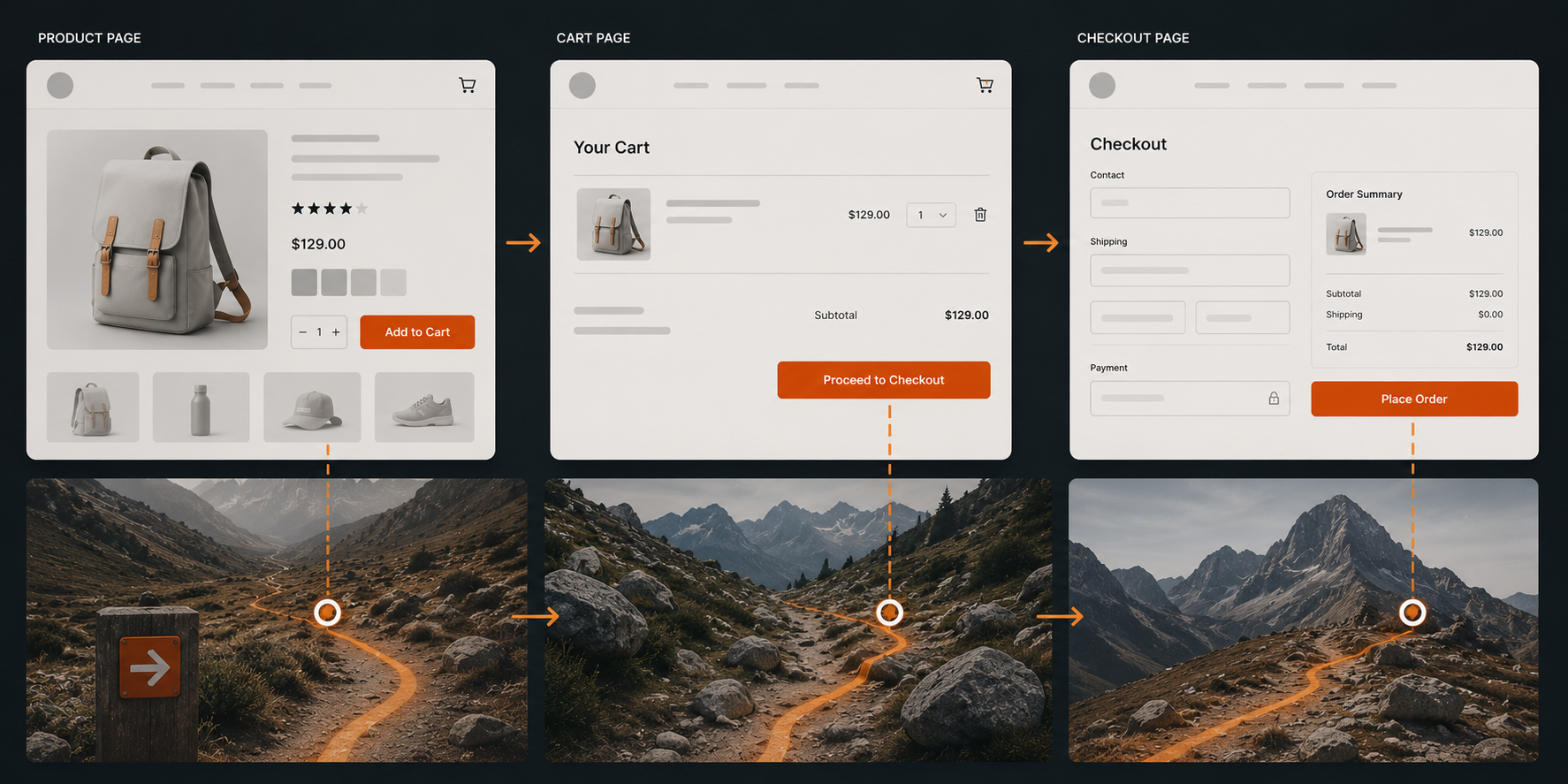
The Conversion Path
Consider a simple e-commerce flow.
The product page uses restrained neutral tones so the “Add to Cart” button becomes the only strong chromatic accent. It stands alone.
The cart page repeats the same accent colour on “Proceed to Checkout,” creating continuity. The user’s eye already understands that this colour means progress.
The checkout page strips back almost every other competing colour so the only vivid element left is “Place Order.” There is nowhere else to look.
A progress indicator does something similar during onboarding. Muted steps sit quietly in the background, the current step receives the strongest emphasis, and completed steps use colour to signal reassurance. The user always knows where they are, what they have done, and what comes next.
This is colour as wayfinding.
The interface creates a visual path users naturally follow.
The most effective interfaces often feel effortless precisely because the user is being guided so carefully.
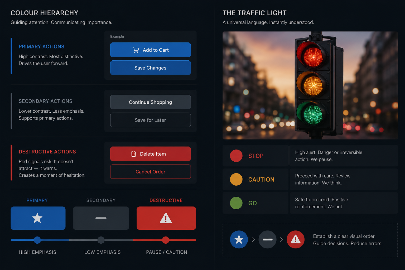
Colour Hierarchy
Well-designed interfaces operate with a clear hierarchy for actions.
Primary actions receive the highest-contrast and most visually distinctive colours.
Secondary actions use neutral or muted tones because they support the primary flow rather than compete with it.
Destructive actions — delete, cancel, remove — often use red, not because designers want to attract attention, but because they want to create hesitation.
A destructive action should feel heavier.
Users should pause before doing something irreversible.
This principle mirrors something universally understood in the physical world: the traffic light.
- Green signals permission and forward movement.
- Amber signals caution and consideration.
- Red signals stop, danger, or risk.
Interfaces inherit this learned behaviour.
The user does not consciously analyse these meanings. They feel them.
This same hierarchy appears in everyday product details. A primary “Save” button might use a strong accent colour. A secondary “Cancel” action may stay neutral. A destructive “Delete account” action should carry enough visual weight to slow the user down.
Tones and Saturation
Choosing a hue is only the first decision.
How vivid or muted that colour becomes changes how loudly it speaks.
A fully saturated colour demands attention.
A desaturated version of the same colour quietly supports the interface instead.
High saturation works best for:
- Primary actions
- Confirmations
- Alerts
- Error states
- Key interaction points
Lower saturation works better for:
- Backgrounds
- Secondary elements
- Inactive states
- Supporting interface structure
A password strength meter demonstrates this beautifully.
It might begin as a pale, desaturated red — signalling danger softly — then gradually move through amber into a vivid green at full strength.
The entire emotional journey from anxiety to confidence is communicated through colour alone.
Tone also changes emotional weight.
A dark red destructive button feels more final than a soft pink one.
A dark interface can feel focused, cinematic, and serious. A lighter interface can feel calmer, more open, and more approachable.
The right choice depends on the emotional register you want the interface to create.
This is why micro-interactions often rely on subtle shifts in tone and saturation. A success toast does not need to shout. A soft green confirmation can reassure the user without pulling them away from their task. An error state may need stronger contrast, but it should still help the user recover rather than make the interface feel hostile.
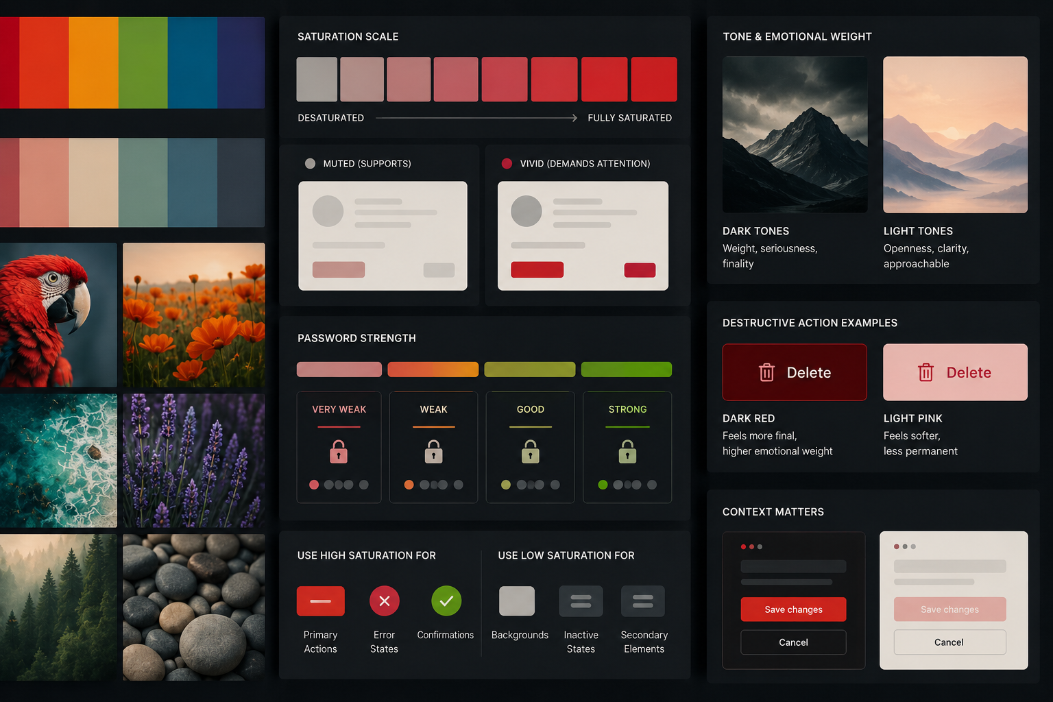
Figure-Ground Contrast
Every interface relies on separation.
Users must instantly understand:
- what is interactive,
- what is background,
- what deserves attention,
- and what can safely be ignored.
This relationship between foreground and background is known as figure-ground contrast.
Without sufficient contrast, interfaces feel visually muddy.
Strong contrast creates clarity.
Weak contrast creates uncertainty.
Good figure-ground contrast helps users scan quickly and confidently without consciously working to decode the interface.
The Conversion Path
Consider a simple e-commerce flow. The product page uses neutral tones so the “Add to Cart” button is the only chromatic accent — it stands alone. The cart page repeats the same accent colour on “Proceed to Checkout,” creating a visual thread the eye follows. The checkout page strips back all other colour so the only vivid element is “Place Order.” There is nowhere else to look.
This is colour as wayfinding — the same principle as a well-marked hiking trail.
Colour Cannot Carry Meaning Alone
Accessibility is not separate from good colour design.
It is good colour design.
Colour should reinforce meaning, not carry meaning entirely by itself.
Users with colour vision deficiencies may not distinguish between red and green in the same way other users do.
Interfaces that rely solely on colour to communicate status or importance can easily fail.
Good interfaces combine:
- colour,
- labels,
- icons,
- shape,
- spacing,
- and typography.
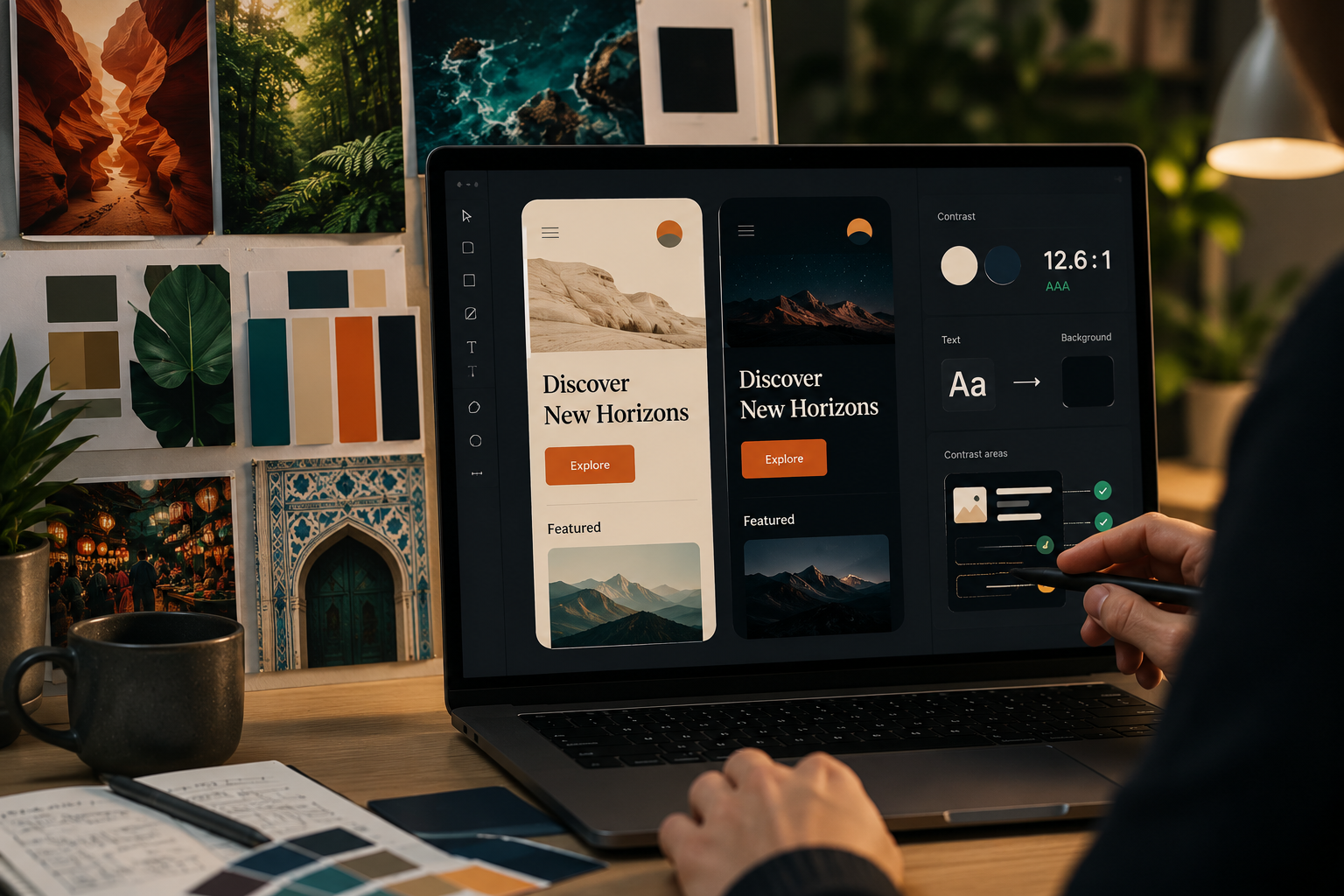
Contrast matters too.
Low-contrast text may look elegant in a design mockup but become difficult to read in real-world conditions.
Accessibility standards such as WCAG exist because readability directly affects usability.
The goal is not merely compliance.
The goal is clarity.
Consistency Creates Trust
Colour becomes more powerful through repetition.
When users repeatedly see the same colours associated with the same behaviours, they stop consciously decoding the interface.
The system becomes intuitive.
A consistent accent colour begins to mean:
“This moves me forward.”
A muted grey button begins to mean:
“This is optional.”
A red warning begins to mean:
“Pay attention.”
This is why design systems matter.
Products like Spotify, Stripe, Slack, Notion, and Shopify rely heavily on restrained, repeatable colour logic.
The consistency creates familiarity.
Familiarity creates trust.
Visual Noise
Every additional accent colour competes for attention.
Interfaces fail when everything is trying to be important at the same time.
When every button is bright, no button stands out.
When every section uses a different colour, hierarchy collapses.
Good interfaces are often surprisingly restrained.
Many modern products use:
- neutral foundations,
- muted supporting tones,
- and a single strong accent colour.
This restraint creates clarity.
The absence of colour is often what gives colour its power.
Colour Systems in Practice
Brand Colour Schemes
How the world's most recognisable brands use colour as strategy.
One vivid green on near-black. The green appears only on active/playing states and key CTAs — so it always means something. Restraint is what makes the accent powerful.
Green = correct, red = wrong, amber = streak urgency. Every interaction is colour-coded. Behaviour change driven entirely through colour — no instructions needed.
Coral/hot pink where every other bank uses blue. The colour IS the brand positioning — warm, approachable, human. Breaking category convention to signal difference.
Purple-to-cyan gradient signals forward-thinking technology. Used consistently, the gradient becomes recognition itself — you know Stripe before you read the name.
Warm, desaturated, soft. The muted palette IS the product promise — calm mind, calm colour. Low saturation used deliberately to reduce visual anxiety.
Warm off-white instead of cold corporate white. Reduces eye strain, signals thoughtfulness. Part of the broader shift from cold to human in digital design.
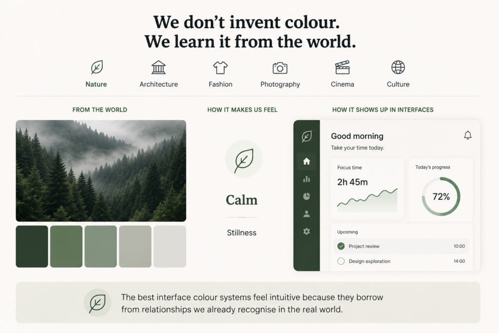
Colour in Nature and Culture
Designers rarely invent colour relationships from nothing.
We absorb them constantly from nature, architecture, fashion, photography, cinema, and culture.
The muted greens and greys of forests feel calm because they echo environments associated with stillness, shade, and slower movement.
Deep reds and blacks can feel dramatic because they carry emotional and cultural weight. They appear in warning systems, theatre, luxury, ceremony, and moments of intensity.
Warm terracotta tones feel tactile because they echo clay, brick, skin, earth, and natural materials we physically recognise
Great designers pay attention to these patterns.
Not to imitate them literally, but to understand how colour creates emotional atmosphere.
The best interface colour systems often feel intuitive because they borrow from relationships users already recognise in the real world.
Cinema, fashion, architecture, signage, transport systems, packaging, and interiors all train our visual expectations. Designers who observe those patterns carefully build interfaces that feel more natural because they are connected to the visual language people already understand.
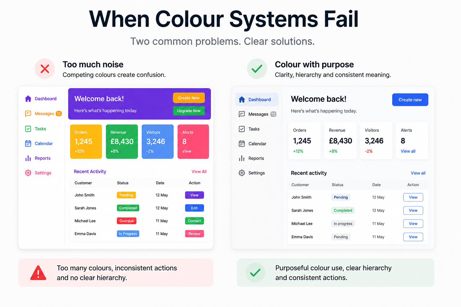
When Colour Systems Fail
Colour systems usually fail when they create more noise than clarity.
This happens when too many accent colours compete for attention, when primary and secondary actions look equally important, or when every section of a page tries to establish its own visual language.
It also happens when colour carries meaning alone.
A red error message without a clear label may be missed. A green success state may not be understood by every user. A low-contrast button may look elegant in a mockup but become unusable in real conditions.
Common colour anti-patterns include:
– Too many saturated colours
– Inconsistent action colours
– Weak contrast between text and background
– Red and green used without supporting labels
– Destructive actions styled too casually
– Dark mode palettes without clear hierarchy
A good colour system reduces interpretation. It helps users understand the interface faster.
The Best Colour Systems Feel Invisible
Users rarely notice colour consciously.
But they feel it constantly.
Good interface colour does not shout.
It guides.
It creates rhythm, trust, caution, clarity, and momentum.
It tells users where to look.
It tells them what matters.
It tells them when to pause and when to proceed.
The best colour systems do not simply make products visually appealing.
They make interaction feel natural.
The best interfaces teach users how to move through them without needing explanation.
Colour is one of the most powerful tools we have to make that possible.
Further Reading
Colour sits at the intersection of psychology, usability, accessibility, and systems design. These resources explore those ideas in greater depth.